
Untitled
1951
Jackson Pollock
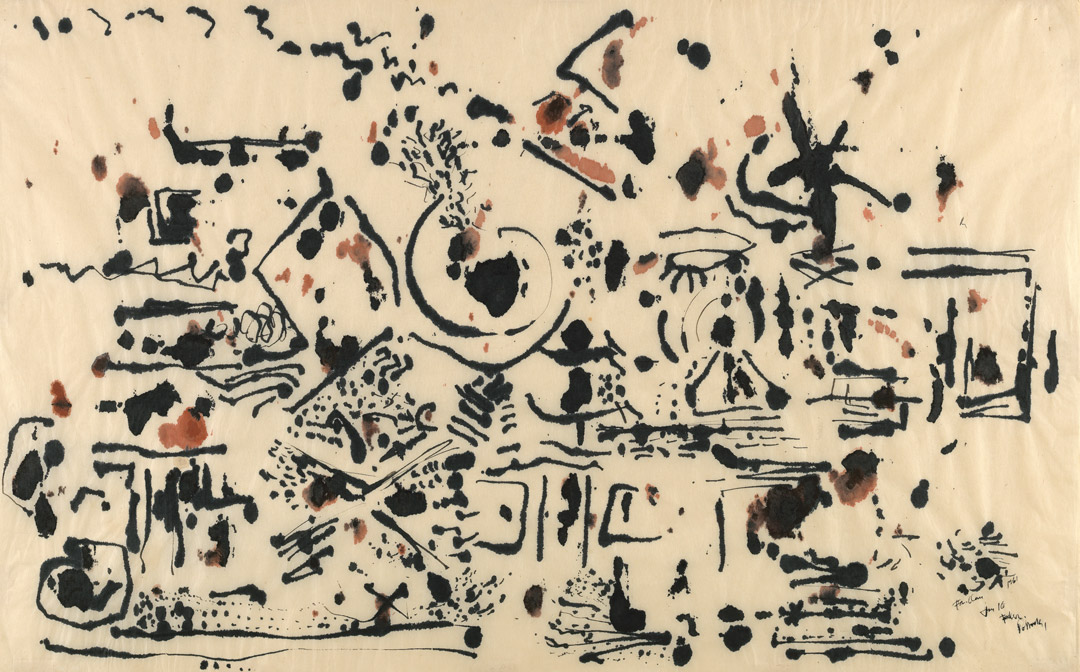
American (1912–1956), black and colored ink on mulberry paper, 24 3/4 × 39 1/4 in. (63 × 99.7 cm), irregular. Seattle Art Museum, Gift of the Friday Foundation in honor of Richard E. Lang and Jane Lang Davis, 2020.14.13. Photo by Spike Mafford / Zocalo Studios. Courtesy of Friday Foundation. © 2021 The Jackson Pollock Estate / Artists Rights Society (ARS), New York.
Untitled
Carter E. Foster
Jackson Pollock’s place in art history owes much to the celebrated images of him engrossed in making his work caught on film and in photographs—almost as much as it does to the actual paintings and drawings that represent his paradigm-shifting artistic output.1 The curator Kirk Varnedoe described Pollock as a “huge permission giver,”2 and critics and other artists recognized how his technique, especially as recorded on film by Hans Namuth, pointed toward new categories of art that would develop and flourish in subsequent decades. Aspects of performance and installation art link back to Pollock’s small, humble, shack-like studio on Long Island where he created his most celebrated paintings, the large-scale canvases on which he famously poured, dripped, flung, and pooled commercial enamel paints to create his profoundly original formal vocabulary. Weaving in and out of a large, ground-laid canvas in Namuth’s famous film,3 Pollock seems the very embodiment of the critic Harold Rosenberg’s phrase about Abstract Expressionist painting being “an arena in which to act.”4 Rosenberg’s other famous descriptor, “action painting,” would seem to put Pollock at odds with the traditional notion of drawing, generally a quieter, more intimate medium not associated with large-scale, broad, gestural application. Yet in many ways, drawing and painting merge in Pollock’s work, especially when one considers the foregrounding of line that was inherent to the artist’s pour technique.
Pollock called his drawing ability as a high school student in Los Angeles “rotten,” and his brother Sande seemed to concur, stating that the young Jack could not render form mimetically in convincing fashion.5 By the time he moved to New York in 1930 and began to study under Thomas Hart Benton at the Art Students League, Pollock’s fellow students apparently recognized his ability to create powerful images on paper, even if his teacher felt he lacked an understanding of drawing’s fundamentals.6 Susan Davidson’s overview of Pollock’s works on paper notes that his drawing style follows the same general arc as his painting.7 By the late 1930s, he had begun using colored pencils and produced an extraordinary group of sheets, some of which show his interpretations of European Renaissance and Baroque painters; others he used in therapy sessions with a Jungian analyst. The most impressive of these powerful formal explorations that toggle between figuration and abstraction and reflect the influence of Surrealism, the Mexican muralists, and Pablo Picasso show an artist able to coax subtle tonalities and wildly inventive shapes from his medium.
This group helps establish that drawing is, in fact, a distinct category in Pollock’s oeuvre, separate from painting, regardless of the strong connection between painting and drawing discussed below. I would argue that his mature pour works on paper are a subcategory of his painting, smaller in scale but similar in technique, style, and aesthetic effect to his classic, much-celebrated large-scale drip paintings of 1947–50. Pollock’s drawings, on the other hand, might be defined as works in which the paper support asserts itself and influenced the types of marks the artist made. The categories can be blurry, especially when the artist used gouache and watercolor, but a number of sheets from the mid-1940s use media and instruments traditionally associated with drawing—pen and ink, pencil, pastel, crayon—with Pollock exploring graphic, linear vocabularies in which one feels the motion of the hand rather than the arm, the forms appropriate to drawing’s smaller and more intimate scale. This is especially true of some of his pen-and-ink drawings featuring tangles of jagged lines that positively brim with energy, such as the Art Institute of Chicago’s 1944 untitled sheet.8
Many writers on Pollock, and the artist himself, have described how drawing and painting are essentially the same thing in his work: that the poured lines he created with his celebrated drip technique are the essence of drawing precisely because they emphasize linearity. In 1965, Michael Fried described the artist’s innovation as a freeing of line “from the job of describing contours and bounding shapes. It has been purged of its figurative character. . . . Pollock’s line bounds and delimits nothing—except, in a sense, eyesight.”9 Fried’s emphasis on what he called “opticality” in Pollock’s work became a touchstone for many of the formalist interpretations of Pollock that had begun with Clement Greenberg in the 1940s. Later, the first in-depth study of Pollock’s drawings, by Bernice Rose, was titled Drawing into Painting to emphasize their interconnection in his practice,10 a title very much aligned with statements by the artist himself, such as, “I approach painting in the same sense as one approaches drawing; that is, it’s direct.”11
The year Pollock made the Lang Collection sheet, 1951, he had begun a new series—now known as the black pour paintings—that he described as “drawing on canvas in black,” and which marked a significant stylistic shift.12 This drawing belongs to a group executed on an absorbent Japanese paper given to him by a friend, the artist Tony Smith. He referenced working on them in a letter to his patron Alfonso Ossorio in January, which suggests he made them in New York, where he was staying at the time, before he returned home to East Hampton in May and began a new group of paintings.13 Crucially, the porosity and absorbency of this particular paper determined the types of marks Pollock could make and his manner of working, for as he started on the top sheet, capillary action carried some of his marks through to sheets below. In a perceptive essay about these late drawings, Stephanie Straine notes that the “structural and conceptual implications of the ‘stack’ is that it moves yet further away from optical flatness. . . . It becomes sculptural in its multi-sidedness. There is a play of call and response across the sheets of mulberry paper.”14 Pollock responded in various ways to the paper’s quality and the staining process, sometimes flipping a sheet and reworking a mirror image on the verso, sometimes elaborating on the stains created from previous sheets. There was, in other words, a temporal and spatial connection across a number of the drawings united by this paper type. And although the layering of Pollock’s marks is not as dense and subtle as some of his earlier poured paintings on paper, due to the way in which the mulberry fibers absorbed the ink, some works in this group do share the “overall” quality of compositional density that is such a hallmark of his most celebrated work.
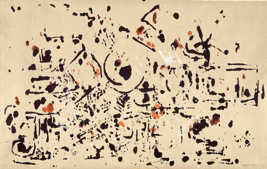
However, this drawing and its companion sheet—the one that was underneath it and thus absorbed Pollock’s marks through capillary action as he was working—are relatively spare for his work, quite a bit less dense than several of the others in the series (fig. 1). They make a fascinating pair because their marks correspond fairly closely, and the only reworking the artist seems to have done on the lower sheet was to add some drippings of white gouache. The second sheet is also a kind of monotype, the first thus both an independent drawing and the matrix used to create its companion. Printmaking was not a significant practice for the artist, so it is interesting to find him working in a “printerly” manner here, whether or not he was aware of it and doing so intentionally.15 Their spareness also allows one to focus more easily on the individual marks and their formal character, as there is abundant negative space without many overlapping elements. It seems likely Pollock was here taking advantage of a new type of drawing instrument, the felt-tipped pen, which was also marketed as a “fountain-brush” or “brush-pen.” Margaret Holben Ellis, who researched the drawing tools Pollock used, quotes an advertisement explaining how “different textural effects can be obtained with a single stroke.”16 By varying the speed and pressure of his strokes, the artist could get thin and thick marks in the same motion, or he could hold the instrument to let the ink seep and penetrate the paper more thoroughly. The Lang sheet is virtually a catalogue of such effects.
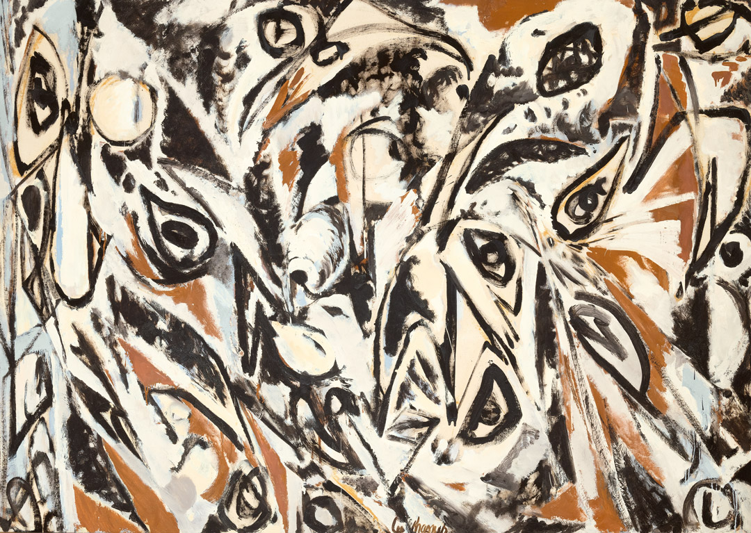
It also has—unusually for a nonfigurative Pollock—a focal point: the large blobby stain close to the composition’s center, whose form the artist expanded by looping a circular swirl of ink around it. The shape evokes an eye, underscoring how the haptic and the visual merge beautifully here. The artist repeated the motif several times, twice in the lower left and again in the center right half (directly below another form that looks much like a closed eyelid with eyelashes), so it clearly interested him. Pollock’s use of such forms involving combinations of angled, straight, and curved lines with soaked-in blobs of ink recalls the hieroglyph-like marks his wife, Lee Krasner, had used in her series of Little Images paintings, works she executed, as one normally would a drawing, on a flat tablet and in a smaller scale (fig. 2). Although her series dates to the late forties, thus a few years before her husband made this sheet, Krasner’s approach intersects here in interesting ways with Pollock’s drawing, whether the influence was direct or not. One could even assert that just a few other works by Pollock share the hieroglyphic nature of this drawing and its companion—that they are in some ways outliers in his oeuvre. On the other hand, they still embody the controlled chance that is the hallmark of his drip technique, albeit in another manner. Here, the capillary action in the paper fibers created chance conditions, ones the artist could affect but not completely control by pressure and time as he applied his instrument to paper. An artist whose works are celebrated for speed and energy has slowed down quite a bit here.
Notes
Carter E. Foster is deputy director for curatorial affairs at the Blanton Museum of Art, Austin, Texas. His exhibition Pollock and the Irascibles: The New York School was accompanied by an extensive catalogue (24 ORE Cultura, 2014).
Notes
1 Pepe Karmel, “Pollock at Work: The Films and Photographs of Hans Namuth,” in Jackson Pollock: New Approaches, ed. Kirk Varnedoe and Pepe Karmel (New York: Museum of Modern Art, 1998), 86–137.
2 Kirk Varnedoe, interview with Charlie Rose, “Great Masters with Charlie Rose,” PBS, January 18, 1999, YouTube, accessed October 30, 2020, http://www.youtube.com/watch?v=_t3Smr1WKQo, quote at 15:54.
3 Hans Namuth, Jackson Pollock 51 (1951), 10:13, http://www.youtube.com/watch?v=6cgBvpjwOGo&feature=player_embedded.
4 Harold Rosenberg, “The American Action Painters,” in Reading Abstract Expressionism: Context and Critique, ed. Ellen G. Landau (New Haven, CT: Yale University Press, 2005), 190.
5 Susan Davidson, “The Gesture of Intimate Scale: Jackson Pollock Paintings on Paper,” in No Limits, Just Edges: Jackson Pollock Paintings on Paper, ed. David Anfam and Susan Davidson (New York: Solomon R. Guggenheim Foundation, 2005), 10.
6 Davidson, “Gesture of Intimate Scale,” 11.
7 Davidson, “Gesture of Intimate Scale,” 11.
8 Jackson Pollock, Untitled, 1944, pen and brush and black and colored inks on ivory wove paper, 187/8 × 247/8 in. (48 × 63.2 cm). Art Institute of Chicago, 1966.250.
9 Michael Fried, Three American Painters: Kenneth Noland, Jules Olitski, Frank Stella (Cambridge, MA: Fogg Art Museum, Harvard University, 1965), 14.
10 Bernice Rose, Jackson Pollock: Drawing into Painting (New York: Museum of Modern Art, 1980).
11 Jackson Pollock, quoted in Pepe Karmel, ed., Jackson Pollock: Interviews, Articles, Reviews (New York: Museum of Modern Art, 1999), 22.
12 Jackson Pollock, quoted in Varnedoe and Karmel, Jackson Pollock, 326.
13 Stephanie Straine, “Beyond Work: Pollock Drawing,” in Jackson Pollock: Blind Spots, ed. Gavin Delahunty (London: Tate Publishing, 2015), 104.
14 Straine, “Beyond Work,” 107.
15 Straine, “Beyond Work,” 107, makes the connection to the monotype process. I borrow the term “printerly” from Jennifer Roberts, “The Printerly Art of Jasper Johns,” in Jasper Johns / In Press: The Crosshatch Works and the Logic of Print (Cambridge, MA: Harvard Art Museum, 2012), 10–42. Charles F. Stuckey has also noted Pollock’s interest in mirroring and the conceptual and structural connection between two sides of the same artwork. See Charles F. Stuckey, “Another Side of Jackson Pollock,” in Karmel, Jackson Pollock: Interviews, 183.
16 Margaret Holben Ellis, “Materials, Tool, and ‘Technics’: Works on Paper by Jackson Pollock,” in Anfam
Explore the Collection
Sort by Chronology
Sort by Artist
Sort by Author
Franz Kline, Painting No. 11, 1951
Acquired November 13, 1970
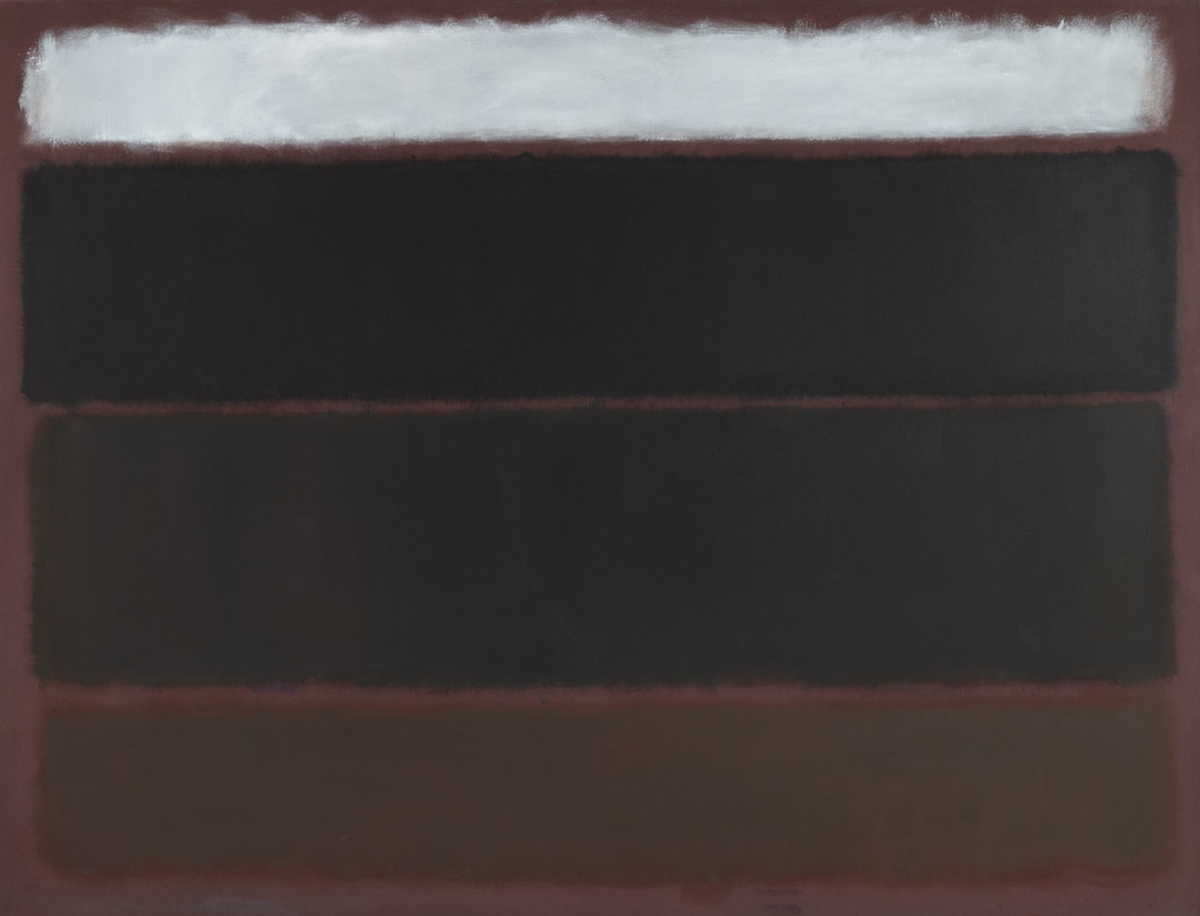
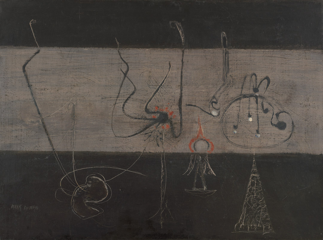
Mark Rothko, Untitled, 1963
Acquired May 18, 1972
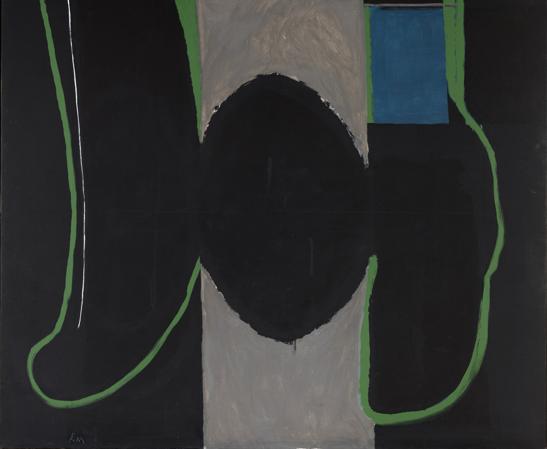
Robert Motherwell, Before the Day, 1972
Acquired October 12, 1972
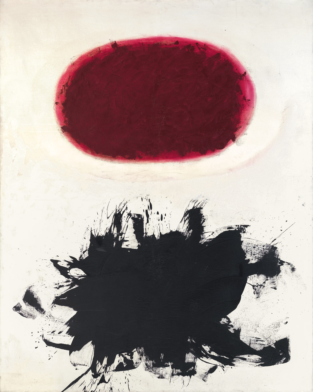
Adolph Gottlieb, Crimson Spinning #2, 1959
Acquired December 11, 1972
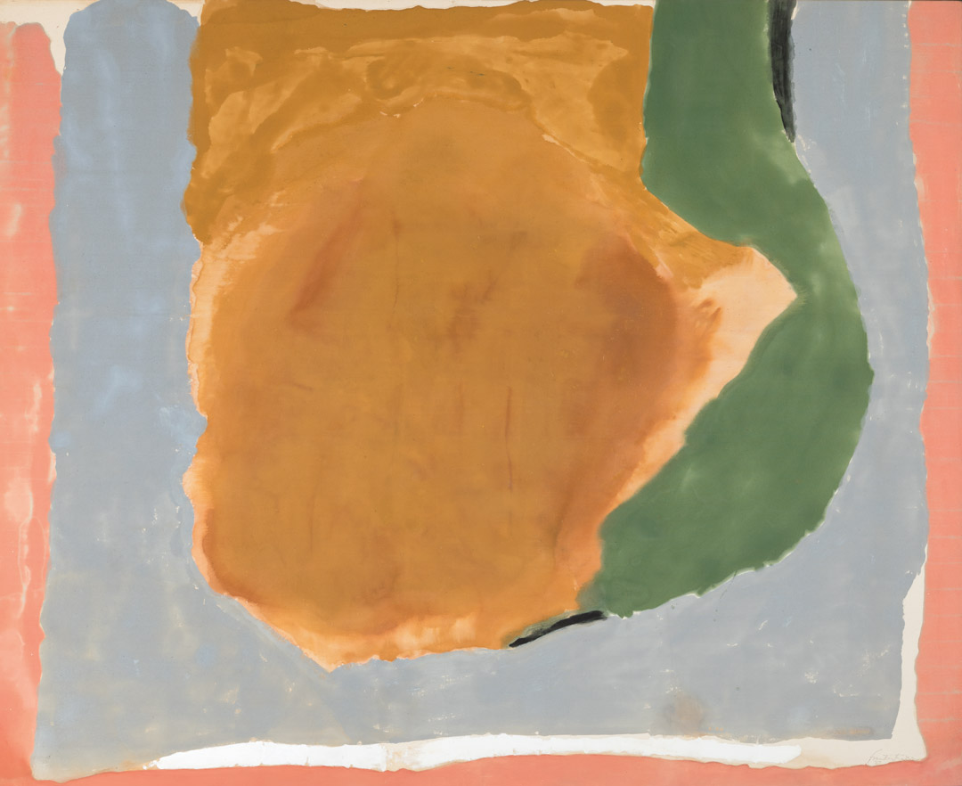
Helen Frankenthaler, Dawn Shapes, 1967
Acquired April 26, 1973
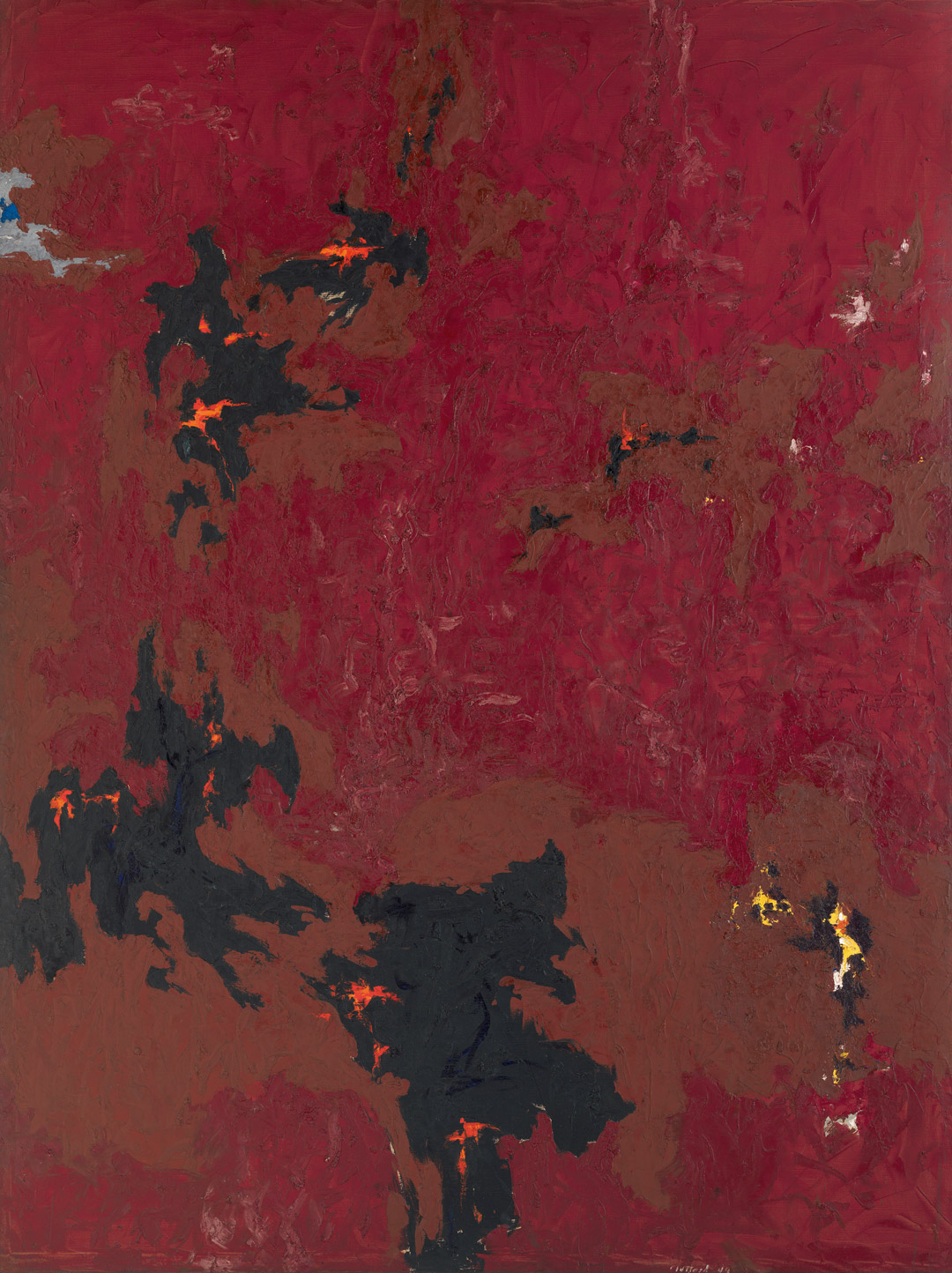
Clyfford Still, PH-338, 1949
Acquired November 10, 1973
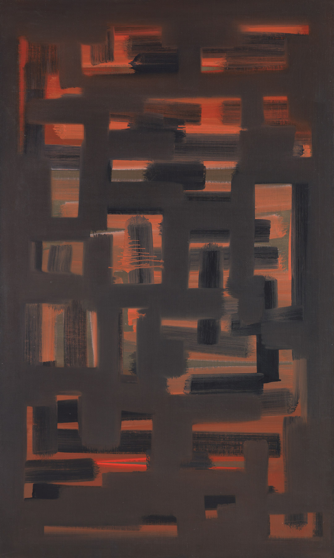
Ad Reinhardt, Painting, 1950, 1950
Acquired January 8, 1974

Jackson Pollock, Untitled, 1951
Acquired March 29, 1974
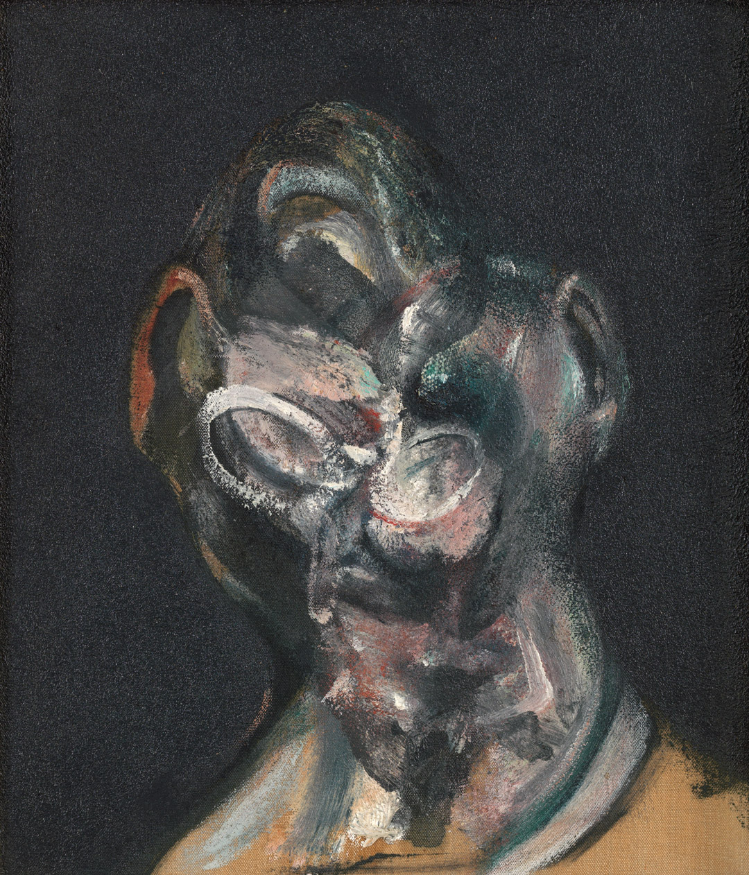
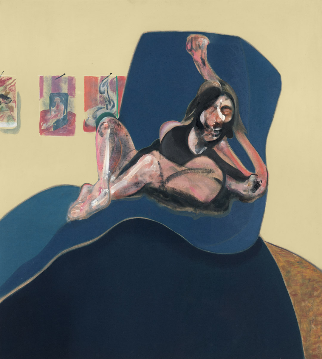
Francis Bacon, Portrait of Man with Glasses I, 1963
Acquired October 24, 1974
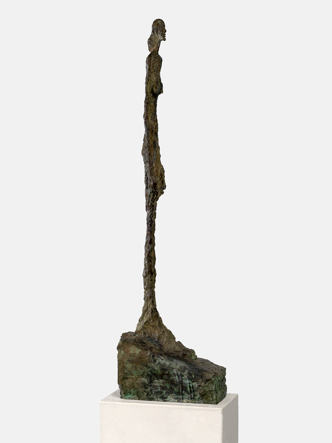
Alberto Giacometti, Femme de Venise II, 1956
Acquired January 2, 1975
Robert Motherwell, Irish Elegy, 1965
Acquired November 7, 1975
Francis Bacon, Study for a Portrait, 1967
Acquired November 20, 1976
Willem de Kooning, Town Square, 1948
Acquired December 6, 1976
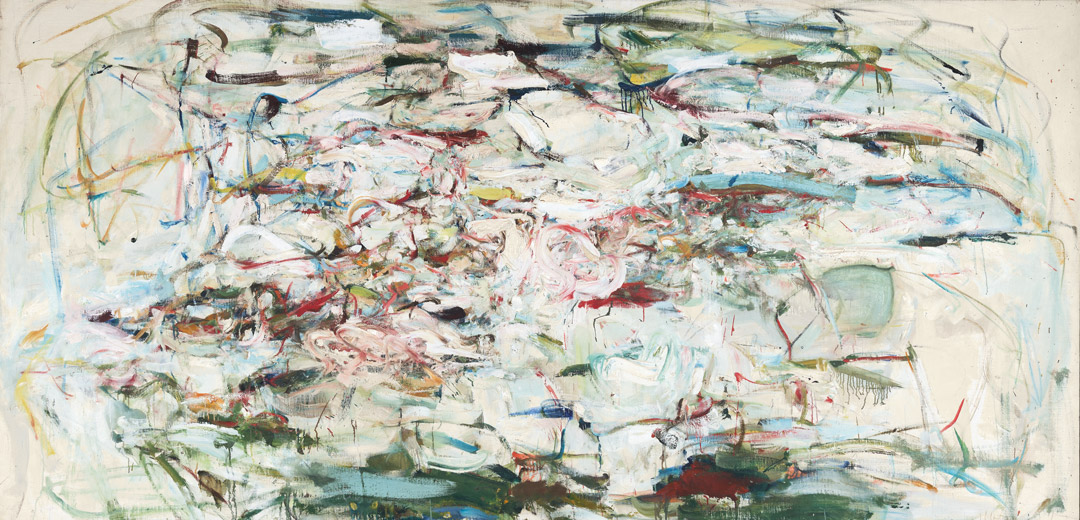
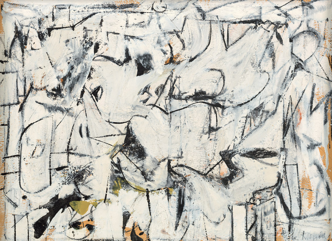
Joan Mitchell, The Sink, 1956
Acquired September 12, 1977
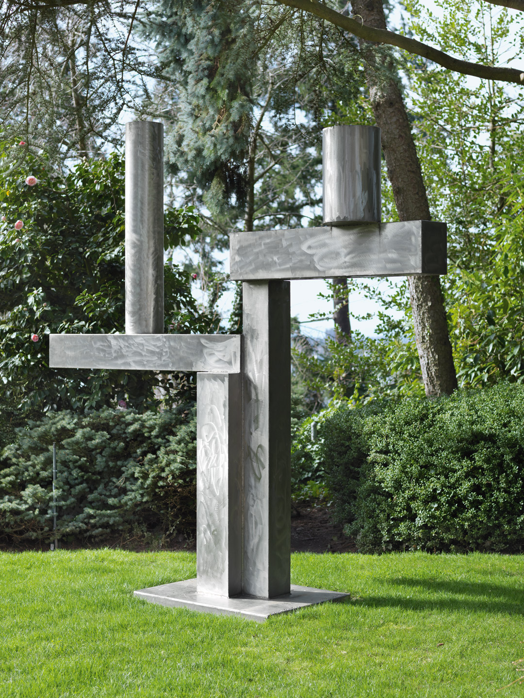
David Smith, Cubi XXV, 1965
Acquired February 22, 1978
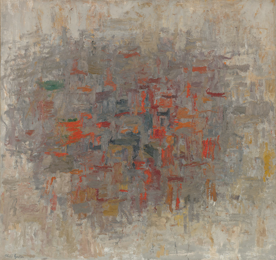
Philip Guston, To B.W.T., 1952
Acquired February 14, 1979
Mark Rothko, Untitled, ca.1945
Acquired November 12, 1980
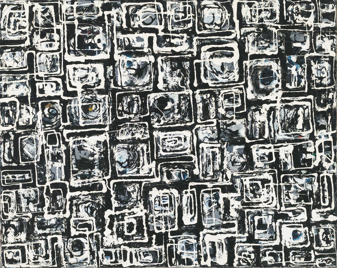
Lee Krasner, Night Watch, 1960
Acquired November 19, 1981
Philip Guston, The Painter, 1976
Acquired February 1, 1982