
To B.W.T.
1952
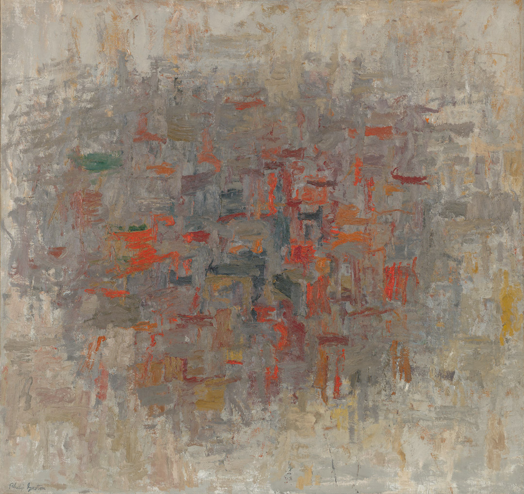
Philip Guston
American, born Canada (1913–1980), oil on canvas, 48 × 51 in. (122 × 129.2 cm). Seattle Art Museum, Gift of the Friday Foundation in honor of Richard E. Lang and Jane Lang Davis, 2020.14.10. Photo by Spike Mafford / Zocalo Studios. Courtesy of Friday Foundation. © The Estate of Philip Guston, courtesy Hauser & Wirth.
To B.W.T.
Robert Storr
Born in Montreal, Canada, in 1913 to Ukrainian immigrant parents who settled in Southern California, Philip Guston knew poverty and social strife from an early age. His first artistic love was the comic strips that he copied from the Sunday newspapers in the solitude of a closet. His next aesthetically formative discovery was the Italian Renaissance, to which a high school teacher introduced him. Nevertheless, despite the revelation the old masters and his mentor provided, Guston dropped out before graduation, never to return, enrolling instead in classes at art schools in Los Angeles. Hardworking and prodigiously gifted, he excelled at emulating neoclassical figuration with a high level of finish. When still in his twenties, he made a reputation for himself in Mexico and across the United States as a painter of heroic-scale murals and complex allegorical canvases. Then, at the age of 36, he unexpectedly turned his back on a promising career in the various representational idioms he had mastered and began, tabula rasa, to improvise abstract compositions out of dense accumulations of simple vertical and horizontal marks, in the process taking his place in the forefront of postwar American modernism alongside Mark Rothko, Willem de Kooning, and his erstwhile high school classmate Jackson Pollock.
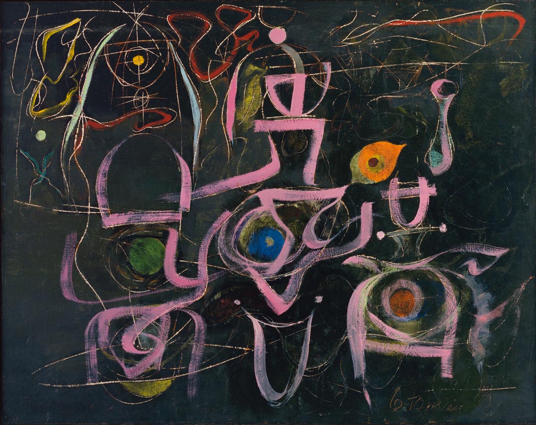
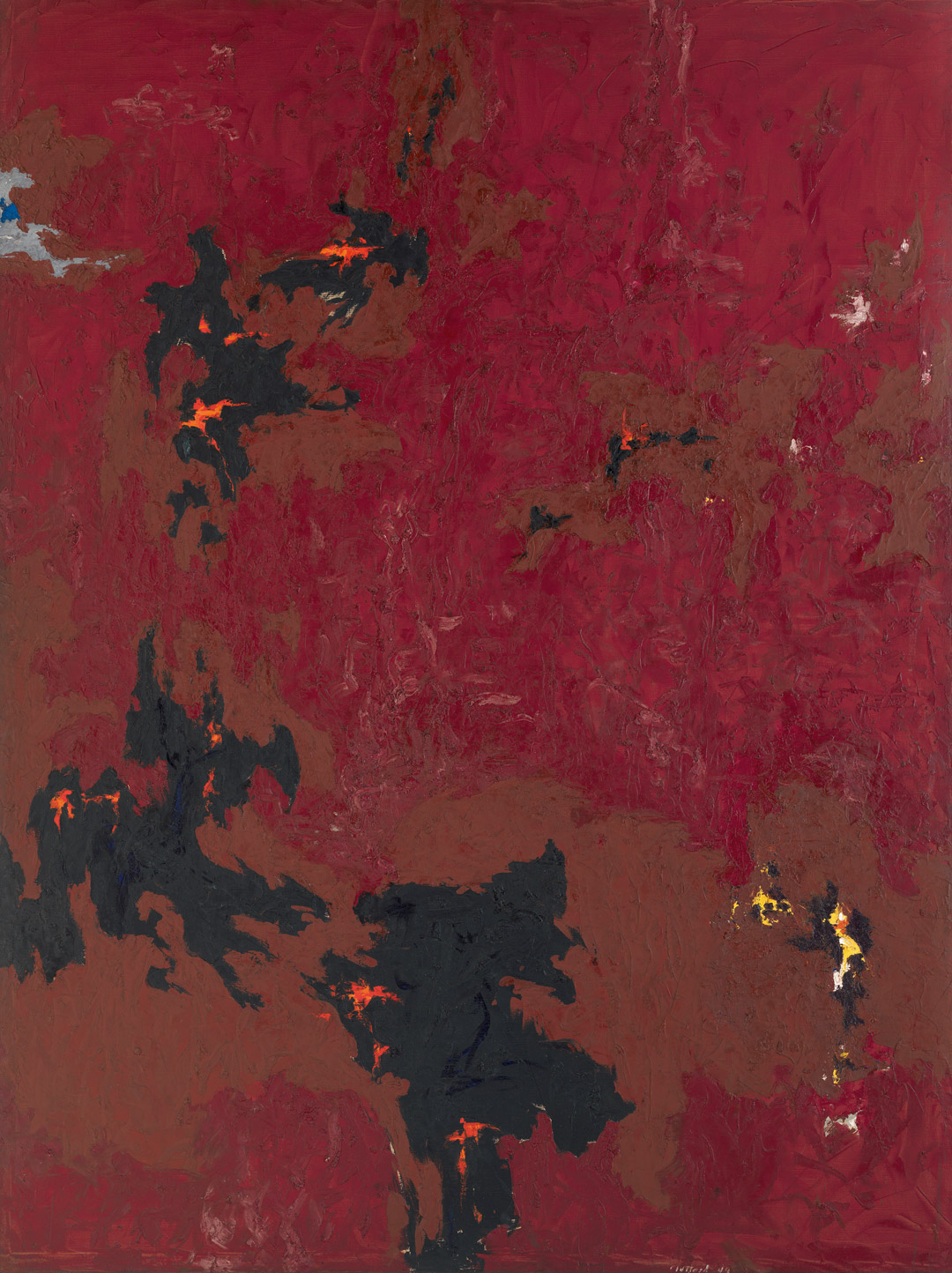
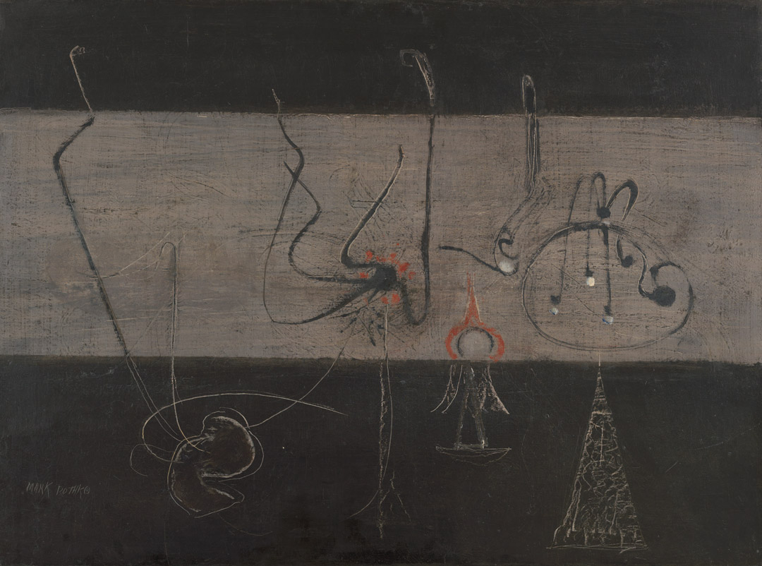
The most elegiac of these early abstractions, To B.W.T. (1952), is dedicated to the most refined and lyrical member of the artist’s New York cohort. Among the bold, gestural painters of first-generation Abstract Expressionism, Bradley Walker Tomlin was a deft calligrapher. With strokes on some occasions leisurely and nearly meandering, while on others short, crisp, and cryptic, he deployed brushes of varying widths like italic pens trailing bands of tone and color (fig. 1). The contrast between a Tomlin line and one by Pollock, for example, is between quivering ribbons and a snapping whiplash. That distinction put Tomlin at roughly an equivalent aesthetic distance from the downtown Manhattan school of muscular angst and from the Northwest Coast master Mark Tobey’s work. With this difference: whereas Tobey seldom mingled socially with his East Coast contemporaries (and not all that frequently on gallery walls), Tomlin lived among his New York School peers and exhibited alongside them like an elder brother or youthful uncle.
Of that legendary group, Tomlin—an archetypal “painter’s painter” whose work was owned by no less discriminating a talent than the proto-Minimalist Robert Ryman—had perhaps the closest painterly affinity with Guston, Pollock’s coeval, approximately a dozen years Tomlin’s junior. Graceful tracery and formal embroidery, rather than propulsive drawing or dramatic mark making, were Tomlin’s forte. Possessed of a fluent command of academic contouring and shading equaled only by Willem de Kooning, Guston harnessed those capacities to the task of delineating intricate scenarios that by the end of the Depression won him precocious fame and numerous prizes and public commissions, including one for the facade of the Works Progress Administration Pavilion at the New York World’s Fair in 1939.
However, by the late 1940s, Guston grew impatient with his acquired facility and the figurative conventions that had paved his way to wide national recognition, and he went back to basics—which for him meant simple structural annotations and tonal as well as chromatic harmonies. The use of musical metaphor is not incidental. Guston’s acquaintance with the avant-garde composer John Cage—who became aware of Tobey while teaching in Seattle at the Cornish College of the Arts—was essential in clearing a path through the thicket of ideas and imagery that had accumulated during the artist’s long apprenticeship to old masters such as Piero della Francesca and modern ones like Giorgio de Chirico and Pablo Picasso, thereby freeing Guston to disregard the picture-laden past and lose himself in the non-objective present.
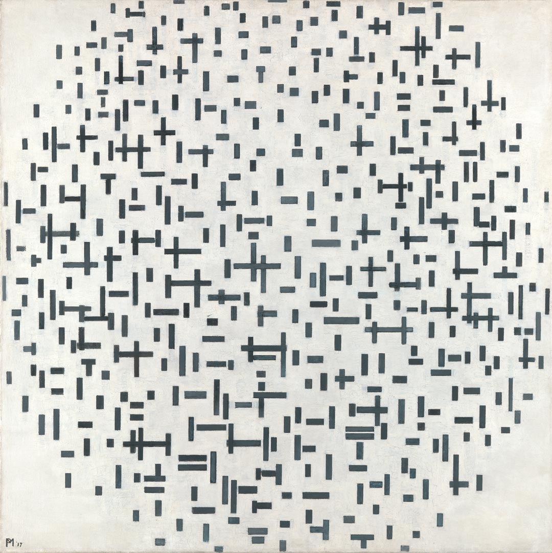
Thus, starting in 1949–50, for the first time in his life, Guston embarked on paintings without a carefully worked-out conception of what the final result would look like—that is to say, without detailing what the subject matter or ultimate formal design of his canvases would be. And, inasmuch as Cage provided him the artistic permission to enter into and reconnoiter the “nothingness” of pure abstraction as an alternative to the fully understood but increasingly daunting “too muchness” of his previous figurative work, the Dutch modernist Piet Mondrian gave him the means for doing so.
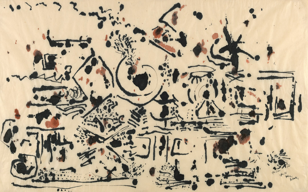
In the early teens of the twentieth century, Mondrian had arrived at a reductive method for charting pictorial space based on fracturing the traditional grid that had underpinned Western perspective since the Renaissance. He then moved the fragments around within the standard rectangle of the pictorial field he had emptied out (and sometimes within ovals inscribed upon such fields, as had been done by the Cubists slightly before him, as well as by portraitists and landscape painters going back centuries). In short, Mondrian delineated the armatures upon which representational art had been hung, leaving out the depiction of natural or human-made forms altogether. Or, at most, hinting at them with details—a curve for a tree branch, a vertical rectangle for a church window—for which no one but the artist could specify the referent with much assurance. These drawings and paintings by Mondrian became known as his Plus/Minus works (fig. 2), because all that remained for viewers to get their bearings were the intersections of vertical and horizontal lines that had once articulated the structural matrix of the image. Instead, that broken matrix was the image in and of itself.
Picking up where Mondrian had left off, Guston, in effect, dispensed with the intermediate stage of disassembling the archetypal grid and mapped out the vacuum of the spatial construct of the canvas with increments of painterly substance. That is to say, he filled the void with solid patches of pigment applied intuitively rather than in accordance with any a priori idea of what the result would or should be, patterning the surface with improvised rhythms and intervals much as a composer like Cage would fill silence with random sounds.
In these transitional works, Guston achieved a degree of ambiguity and suspended animation that suggests the gradual coalescence or dissolution of something evolving or devolving that transformed the painting as a whole into a drama of accretion or, conversely, one of disintegration. Viewed another way, Guston created paintings that served as existential clocks that told the time of becoming and of decay.
To B.W.T. is a prime example of this chapter in the story of Guston’s unceasing metamorphosis as an artist. Indeed, metamorphosis is the leitmotif of his art, both abstract and figurative, from the early 1950s through to the end of his life thirty years later. In this instance, the shreds or fibrous facets of forms float in a shallow pool of mottled grays, massing toward the center of the horizontal canvas in something resembling an oval that recalls Mondrian’s paradigm, but devoid of rigid angles. The net effect of this loose, trial-and-error approach to composition is the exact opposite of the hard-and-fast quality of so much Cubist and Cubist-derived painting. Rather, it is an emblem of perpetual flux, of the shift and shimmer of scintillating natural forms in a tide pool.
The analogies used here, or similar ones, frequently occur to viewers anxious to translate paintings that are neither more nor less than that—paintings. Yet the work is not, as some critics of the 1950s were quick to infer, an incidence of Abstract Impressionism; any claim to the overt emotions associated with the rubric of Abstract Expressionism would be similarly hard to justify. Palpable emotion is certainly present in each brush mark Guston made, but that feeling is anything but demonstrative. Rather, it is doubt laden and nervously probing, though never tentative, like a stick poking a banked fire or the still-glowing embers in the ashes of one that has all but burned out. In short, characteristics that lend the image its tenuous intensity, its elegiac aura, its look of a once-blazing hearth that has almost consumed its fuel.
Its special muted radiance is owed to the subtle contrasts between dispersed patches of golden yellows, blood reds, and dense orange, dull greens and a full spectrum of quiet grays whose chromatic neutrality and faint unnamable tinting assume the glow of hues complementary to the colors to which they are juxtaposed. The amalgam they constitute is held together in space by the vibrant optical tensions Guston is able to orchestrate in the dim ambience of his painterly field.
Comparing the evanescent quietude of To B.W.T. to Guston’s figurative work of the 1940s, one finds the same moody, elegant inwardness in a radically different stylistic idiom; in short, one meets the same man. Compared to the grand manner of his murals, these canvases almost appear to be the work of a different artist altogether. However, this discrepancy reminds us that the two approaches are all of a piece, since the drama of Guston’s art is precisely that of a sensibility that is not so much at odds with itself as one that refuses to look away from its multifaceted dualities. During the last ten years of Guston’s career, they fused in tragicomic figurative works of astonishing poetic scope, emotional complexity and force, and unprecedented graphic invention, works that made Guston the touchstone for the Neo-Expressionists and New Image artists who emerged in the decade following his death in 1980. The later, 1970s paintings resonate as wholly contemporary even today because of their prescient articulation of America’s abiding malaise and bad conscience.
Author
Robert Storr is an artist, critic, and curator based in New York. He was previously senior curator of painting and sculpture at the Museum of Modern Art, New York, and professor of painting and printmaking at Yale University School of Art. His writings on Philip Guston include Philip Guston (Abbeville, 1985) and Philip Guston: A Life Spent Painting (Laurence King, 2019).
Explore the Collection
Sort by Chronology
Sort by Artist
Sort by Author
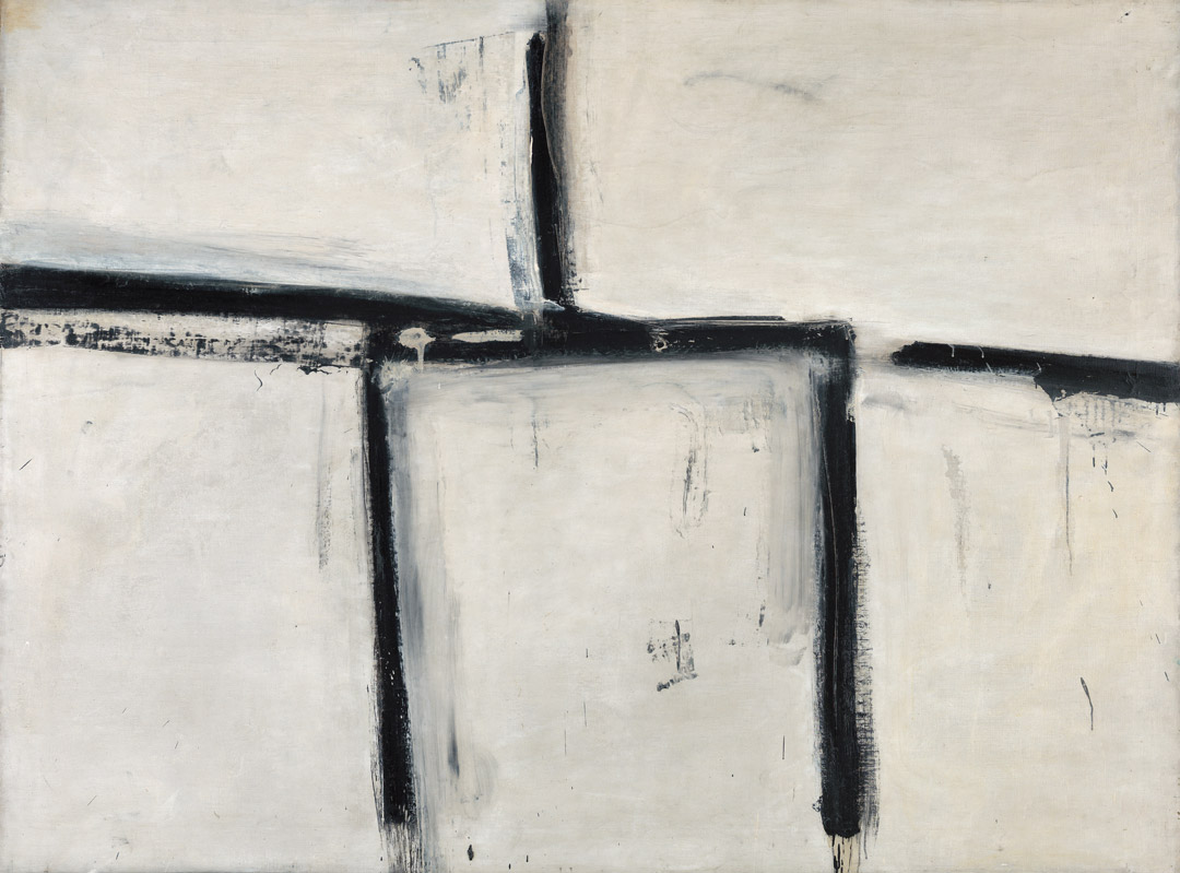
Franz Kline, Painting No. 11, 1951
Acquired November 13, 1970
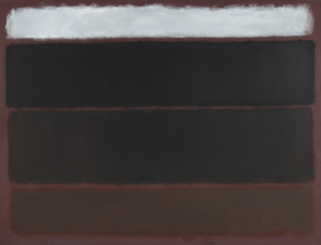
Mark Rothko, Untitled, 1963
Acquired May 18, 1972
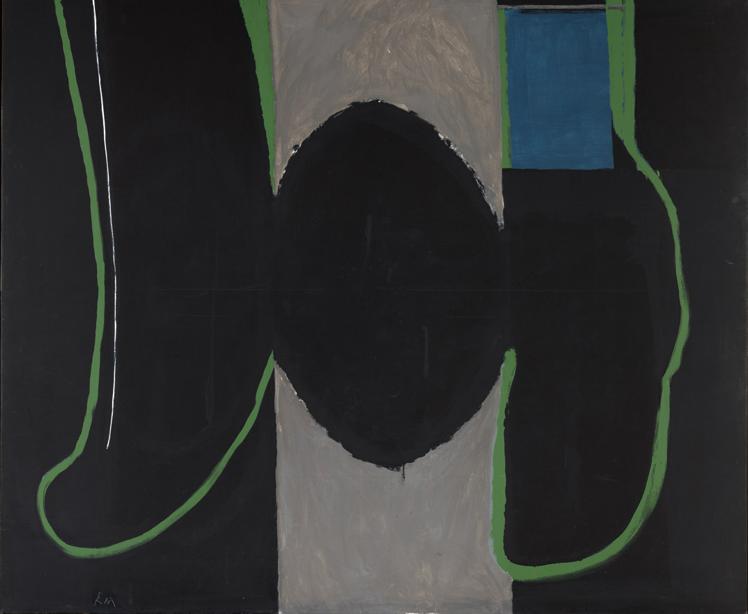
Robert Motherwell, Before the Day, 1972
Acquired October 12, 1972
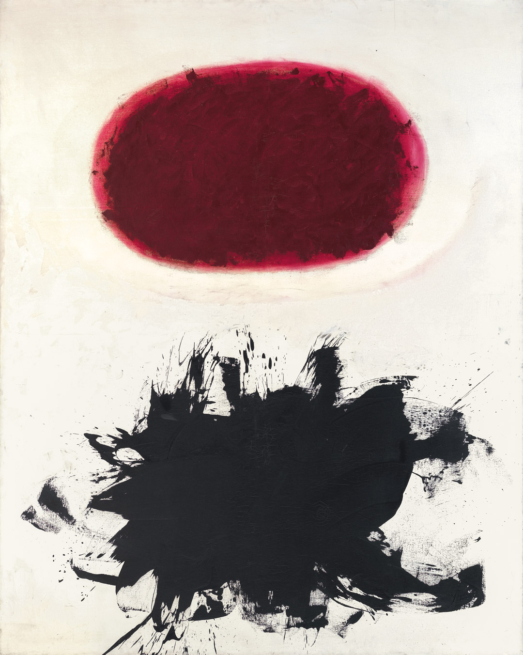
Adolph Gottlieb, Crimson Spinning #2, 1959
Acquired December 11, 1972
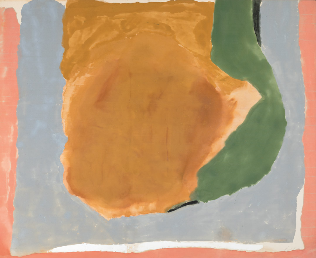
Helen Frankenthaler, Dawn Shapes, 1967
Acquired April 26, 1973
Clyfford Still, PH-338, 1949
Acquired November 10, 1973
Ad Reinhardt, Painting, 1950, 1950
Acquired January 8, 1974
Jackson Pollock, Untitled, 1951
Acquired March 29, 1974
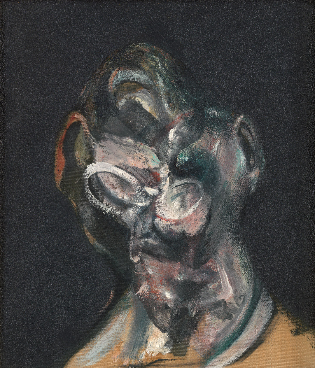
Francis Bacon, Portrait of Man with Glasses I, 1963
Acquired October 24, 1974
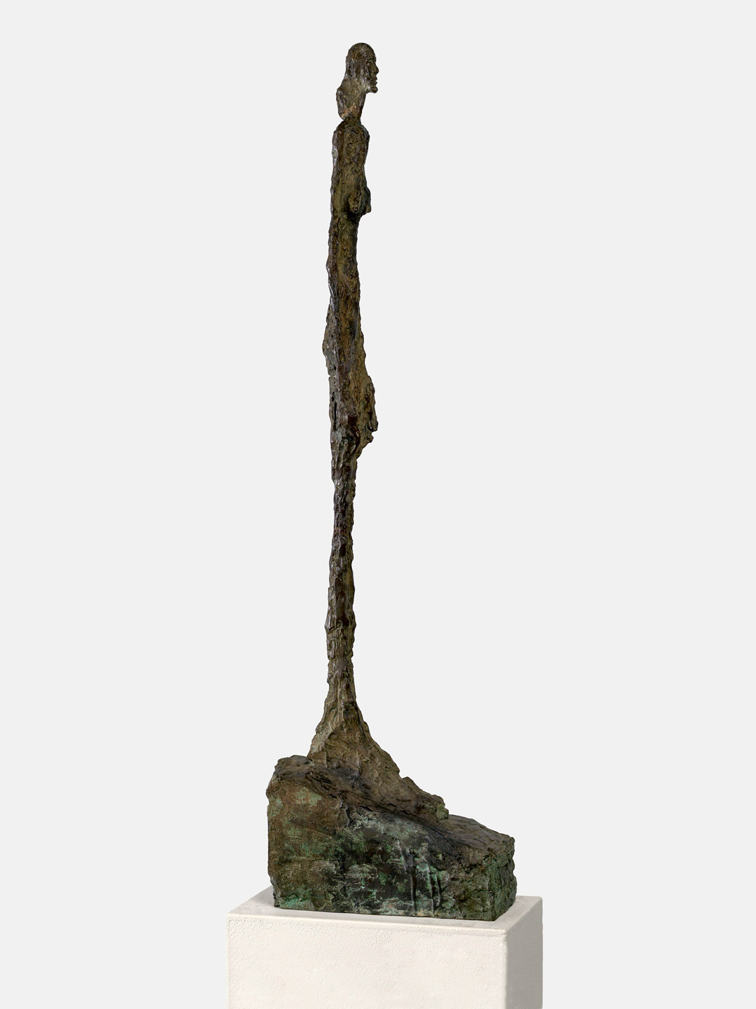
Alberto Giacometti, Femme de Venise II, 1956
Acquired January 2, 1975
Robert Motherwell, Irish Elegy, 1965
Acquired November 7, 1975
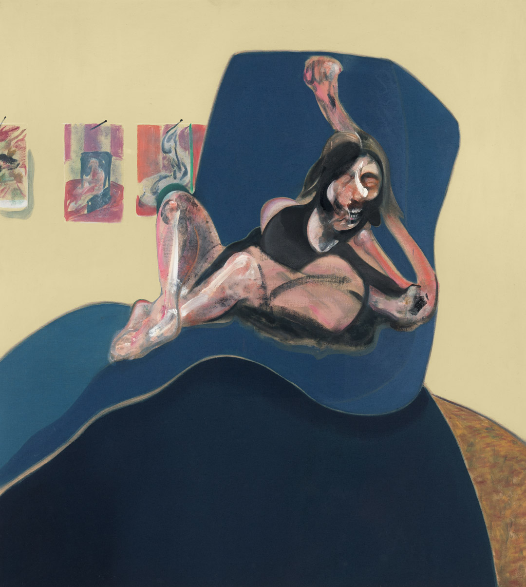
Francis Bacon, Study for a Portrait, 1967
Acquired November 20, 1976
Willem de Kooning, Town Square, 1948
Acquired December 6, 1976
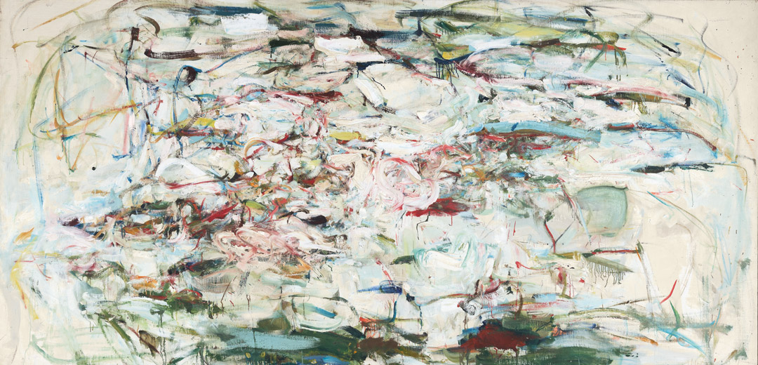
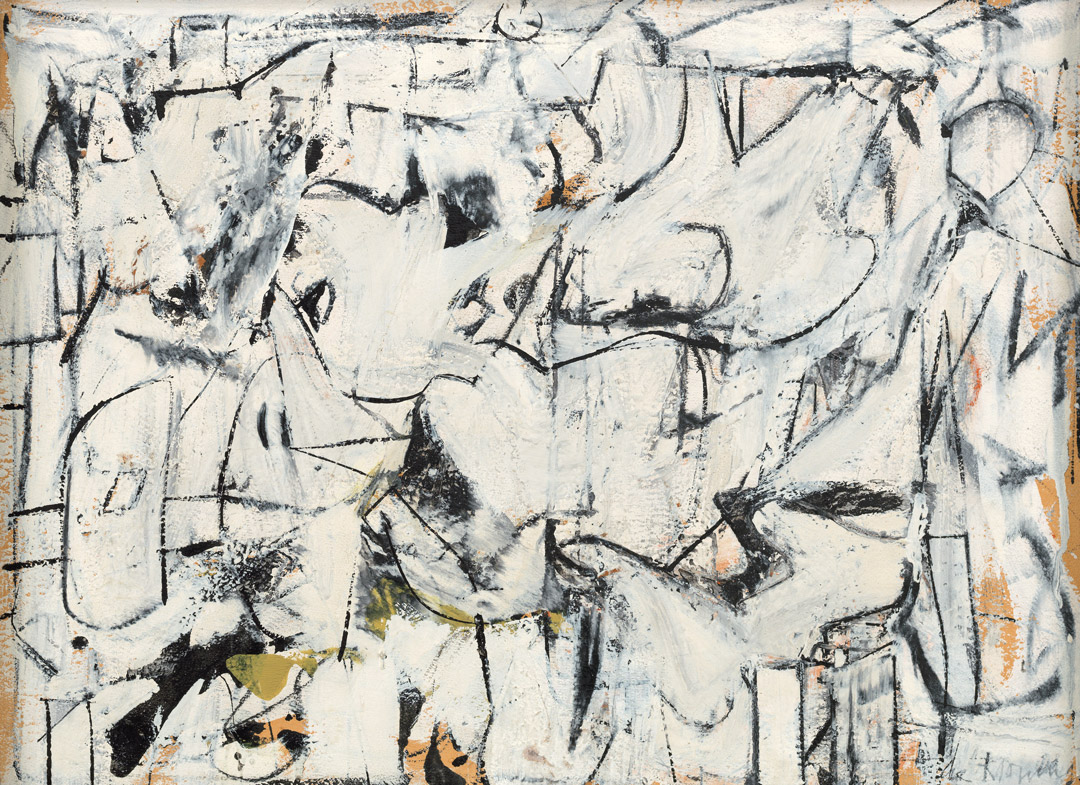
Joan Mitchell, The Sink, 1956
Acquired September 12, 1977
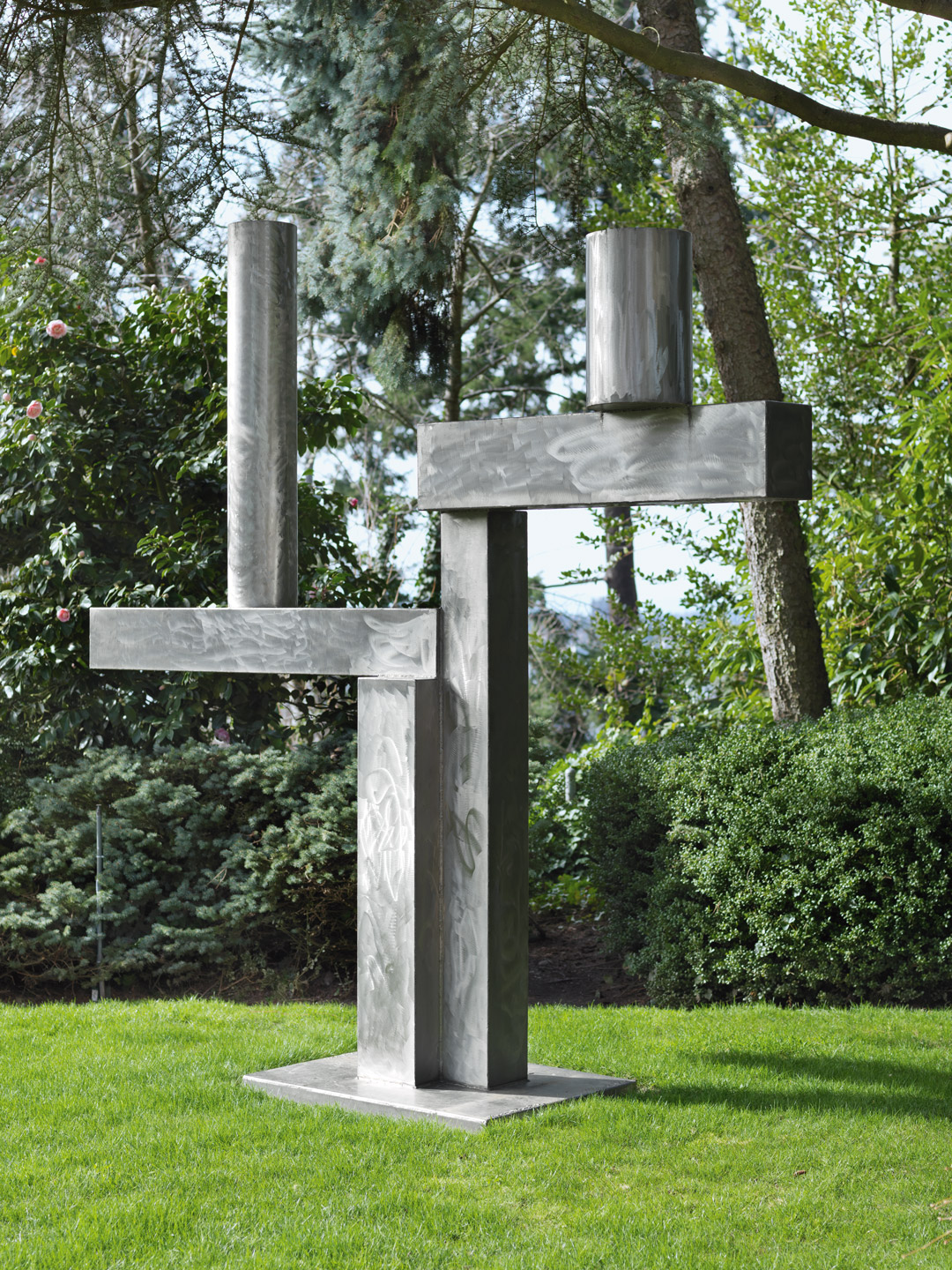
David Smith, Cubi XXV, 1965
Acquired February 22, 1978

Philip Guston, To B.W.T., 1952
Acquired February 14, 1979
Mark Rothko, Untitled, ca.1945
Acquired November 12, 1980
Lee Krasner, Night Watch, 1960
Acquired November 19, 1981
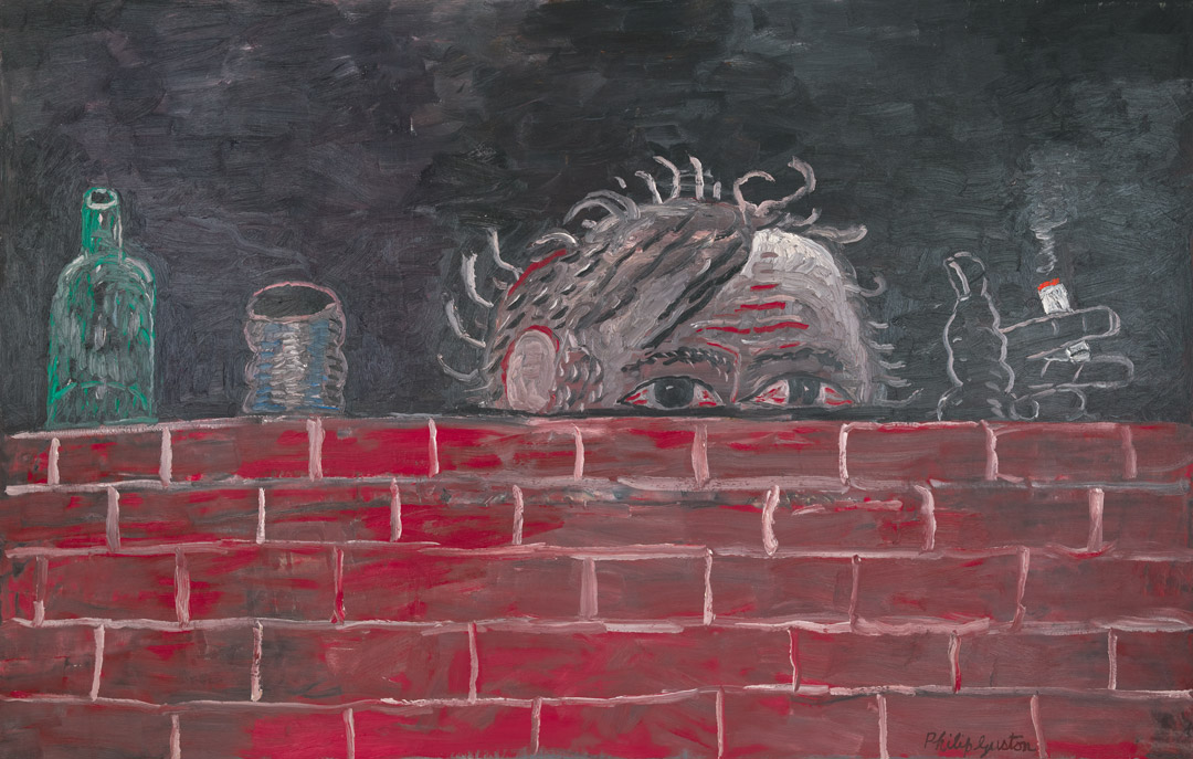
Philip Guston, The Painter, 1976
Acquired February 1, 1982