Town Square
1948
Willem de Kooning
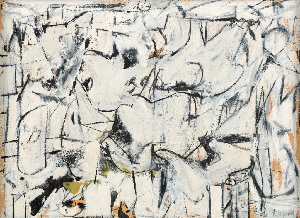
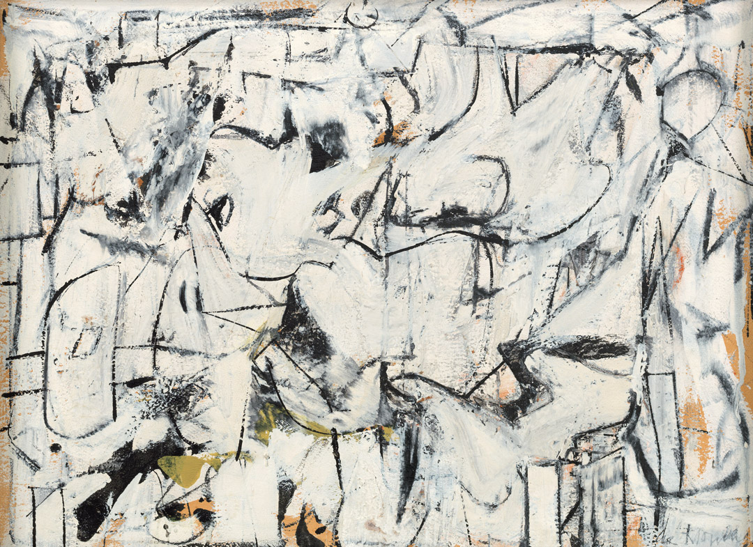
American, born the Netherlands (1904–1997), oil on paper mounted on Masonite, 17 3/8 × 23 3/4 in., Gift of the Friday Foundation in honor of Richard E. Lang and Jane Lang Davis, 2020.14.2, © 2021 The Willem de Kooning Foundation / Artists Rights Society (ARS), New York.
Town Square
John Elderfield
Willem de Kooning’s rapid development in the second half of the 1940s—roughly speaking, from Pink Angels in 1945 to Excavation in 1950—belongs among the greatest short periods of radical change in modern art. Moreover, his invention over these years was not only continual, always going on—as was, for example, Henri Matisse’s transformation of his art from 1905 Fauvism to 1910 high decoration. De Kooning’s was among the few such transformations that were also continuous, uninterrupted in time and sequence, comprising not the replacement of one style by another but an unbroken process of revising a personal vocabulary with ever more ambitious results.1
In this respect, de Kooning’s richly productive period corresponds to that of his peer Jackson Pollock over roughly the same span of time: from works like Mural of 1943–44 to his all-over abstractions in 1948–50. They differ, though, in two important ways. First, de Kooning found that canvases of a relatively small size better served to maintain the momentum of his experimentation, given his meticulous, time-consuming methods; he only moved on to make large paintings at the end of this period, in 1949–50.2 By contrast, Pollock’s full-arm sweeps of paint in his canvases of the mid-1940s, and then his pouring it in layers, allowed and demanded large canvases; and he, in fact, opened this period with the very largest of its paintings, Mural, then worked back to something approaching its enormous size in 1950. The fact that de Kooning was able to work at a Pollock-like scale at that same time—in consciously summative works of 1949–50, Attic and especially Excavation—is testimony to the plateau of his extraordinary achievements in 1948–49, to which the Lang Collection painting Town Square belongs.
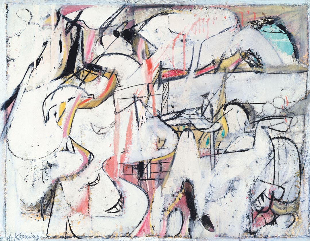
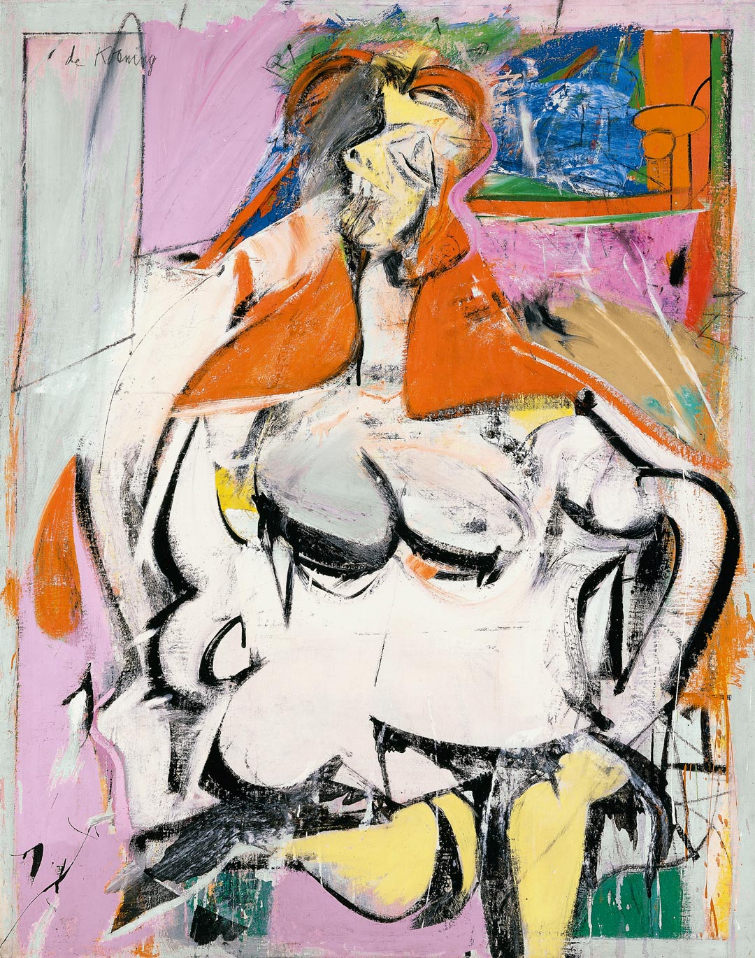
The second difference between Pollock’s and de Kooning’s developments over these years is simply that Pollock’s paintings were abstract, whereas the course that de Kooning charted at mid-decade is unique in encompassing both abstract and figurative paintings. And it is more complicated than that: technical examination shows that some of de Kooning’s works began as abstractions and became figurative.3 Body parts depicted in some figurative works are little different from difficult-to-describe parts of abstract works; for example, the shape of the torso of Woman (1949, fig. 1) is similar to the shapes at the center of the roughly contemporaneous Town Square. And while paintings like Town Square caused de Kooning to be dubbed by the critic Clement Greenberg “an outright ‘abstract’ painter,” his putting the adjective in quotation marks concedes that a canvas like this can only be called abstract because it cannot be said to be representational.4 Neither one nor the other but both, it is better described as a hybrid composition; and what follows will be concerned with the place of Town Square among de Kooning’s hybrid canvases of 1948–49.
The hybridity and modest size of these works recall those painted by Pablo Picasso and Georges Braque in their four-year transformation of Cubism from the rudimentary abstraction of 1908 to its high Analytical style of 1911–12, before inventing collage. Moreover, some of the methods and some details of the appearance of de Kooning’s paintings bear comparison with Analytical Cubist canvases of the latter half of that time span, sharing with them qualities of investigative care and patient thoughtfulness in the shaping, placing, and spacing of forms, guided by the articulation of their drawing.
De Kooning’s lengthy negotiation with Cubism is a larger subject than can be explored here in the depth it requires. For present purposes, though, we do need to know that in the 1930s he had followed the lead of his elders in adopting a flat, simplified, abstract style ultimately grounded in Cubist collage and based on Picasso’s then-recent work; and he clung to vestiges of that style into the first half of the following decade even while enriching it in a painterly, expressive manner. While critics have mainly, and correctly, seen an indebtedness to Picasso in de Kooning’s more expressive, figurative works, he himself stressed the importance of a very different quality: in 1951, he would say, “Of all movements I like Cubism most. It had that wonderful unsure atmosphere of reflection—a poetic frame where something could be possible, where an artist could practice his intuition.”5 Integral to what de Kooning achieved in the half decade preceding that statement is that he returned the methods of collage to their origins in Analytical Cubism and found new direction there. And it can hardly be coincidental that in the autumn of 1946, the Museum of Modern Art published Alfred H. Barr Jr.’s Picasso: Fifty Years of His Art, with its compelling set of illustrations of Analytical Cubist paintings—in black and white, of course.6
To look at Town Square and particularly at the background of a Picasso of 1910 (fig. 2), while ignoring the very different vocabulary of the drawn elements (itself, soon to be influential upon de Kooning’s canvases), is to see in both paintings a wonderful, unsure atmosphere of reflection: compositions of more or less independent planes, depicting parts of not easily identified objects, set flatly in parallel to the picture plane; shading relegated to the boundaries of these planes; and a minimal amount of an illusion of space separating their own flatness from the literal flatness of the surface itself.7 Whereas the planes in the Cubist paintings resemble the facing surfaces of solid, boxlike volumes, many folded flat, those in de Kooning’s are decal-thin and layered. In either case, though, how the illusion of space is calibrated depends upon how firmly or not the artist drew the edges of the planes, edges that separate one plane from another adjacent to or overlapping it, or from an adjacent area of space; and on the number and density of planes in a composition—interrelated factors, as we shall see.
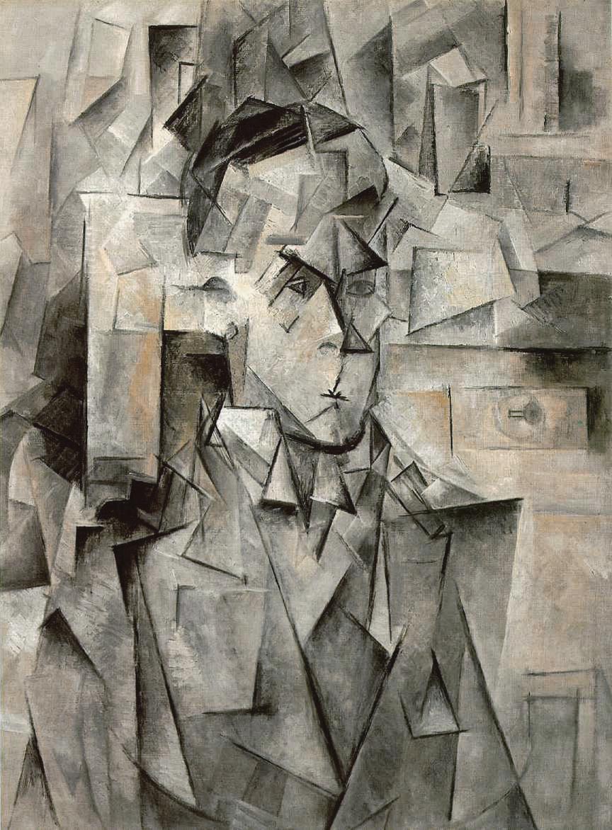
When de Kooning went to teach at Black Mountain College in North Carolina in June 1948 after the opening of his first solo exhibition, at the Charles Egan Gallery, New York, “he spent the entire summer on one small painting,” Elaine de Kooning remembered.8 However, that is only part of the story because, she acknowledged, “he began to fill [his North Carolina studio] with pastels, working feverishly on one after the other for a couple of weeks until the walls were covered with them.”9 That was how he worked in his New York studio as well. It is not to be doubted that Town Square itself was the result of a similar process of feverish experimentation and gradual honing of options to produce the completed work.
As de Kooning’s friend the critic Thomas B. Hess explained: “He will do drawings on transparent tracing paper, scatter them one on top of the other, study the composite drawing that appears on top, make a drawing from this, reverse it, tear it in half, and put it on top of still another drawing.”10 Describing a similar canvas to Town Square, one of de Kooning’s former Black Mountain students observed, “He made a drawing of it, to work on parts where he felt there was a problem. He worked on that picture carefully. ‘Maybe I could throw a line here,’ he would say. He would erase parts, redraw it. In other words, he did it like Ingres. It was not throwing his guts on the wall.”11 In other words, de Kooning’s methods could not be further from what the critic Harold Rosenberg called “action painting,”12 and very precise drawing was critical to how he made these works. In fact, how he made drawing an agent of design and composition as much as of depiction is perhaps the most useful way of understanding their development in this great period.
We have in-process photographs of early stages of a small number of de Kooning’s 1949 canvases—unfortunately, not of Town Square—showing instances where he developed a composition with detailed, methodical drawing, then buried it beneath the surface while recapitulating it there in a revised form to complete the painting.13 If there is drawing of this sort beneath the surface of Town Square and similar canvases, its recapitulation upon the surface is much freer, more obviously improvised.14 That is to say, while such canvases are far too carefully composed to be thought examples of “action painting,” they are patently performed. As de Kooning said of Cubist canvases, they are places “where an artist could practice his intuition.”15
Doing so, de Kooning found himself engaged in the art of adjustment. The means he employed in this task were, as noted earlier, how firmly he drew the edges of the planes, and the number and density of them he used in a painting. Both of these challenges, each a matter of surface composition, were affected by—and influenced—how de Kooning managed the planes so that they appeared to be layered.
Beginning in 1945, relative density of composition is perhaps the most conspicuous factor of change in de Kooning’s art. By and large, he then began to move, sometimes simultaneously but more often sequentially, between disposing his planar shapes to greater and lesser degrees of density: making a group of more crowded canvases, then a group of less crowded, usually somewhat larger ones, and so on.16 Hence, densely packed works of 1948–49 followed the more open ones of 1947–48 that composed the majority shown in de Kooning’s first solo exhibition. Making one of the paintings in that exhibition, Mailbox (1948, fig. 3), he disposed the larger forms so that they all lie more or less in plane, forming the proximate layer of the depicted incident; have open spaces around them that reveal a more or less continuous drawn layer beneath them; and rest on a ground plane beneath that. There is some overlapping of these layers, but not sufficiently so as to negate the effect of foreground and background—and other paintings in the exhibition convey that effect more vividly.17
Painting by layering, which we see in Pollock’s as well as de Kooning’s work of these years, goes back to Paul Cézanne’s interest in the appearance of strata in rock faces.18 It survived in the layering of early Cubist collages before they became the flat, jigsaw-like unities—their space squeezed out of them—that shaped the airless abstractions de Kooning inherited in the 1930s. Since the mid-1940s, he had been prizing open the space in his paintings, and the works in his first solo exhibition were the result. That achieved, he then brought together and compressed not only the elements of composition but, in doing so, also the layers of stratified depth.
It is clear that de Kooning painted Town Square in layers, but he does not let the painting read as layers; the foreground-background effect of Mailbox has gone. He drew the black lines at varying speeds and densities to orchestrate movement within, around, and between the forms they describe. And he wiped and smeared areas of paint to break boundaries of forms, joining solid to solid, space to space, and space to solid. He will make an individual plane overlap another as often—or as well—as rest upon another, but there are so many places where it is uncertain whether a plane is a solid or a space. They so infiltrate one another, even as they jostle with and deform one another, that the only certainty is awareness of the ground layer as having been brought forward flat on the surface. There is nothing imaginable behind or around the frontal array of such a painting except its literal support.
Because de Kooning made Town Square on a rough and possibly roughened ground, his brush skipped in numerous places as he painted the black lines and areas of shading.19 The effect, reminiscent of frottage, pits the surface with small fragments of broken lines and out-of-focus patches of shading that prevent the dark tones from unduly receding. And to further influence the perception of space, de Kooning calibrated the relative brightness of the cool white paint by varying the size and density of the areas it fills: smaller white areas enclosed by black, unless toned down, tend to seem brighter and nearer than larger ones. And he complicated these effects by warming the white paint in places by the presence of sudden glimpses of the orange-ochre ground, and by delicate warm tints produced by the brush pulling up paint from the ground or by whites thinned to function as glazes.20 All of this brings the ground layer up to join in a dynamic play between the medium applied and the surface to which it is applied, and what is subsequently applied on that.21 The result is, within a mere few hundred square inches, a master class in miniature on the practice of intuition in drawing and spreading paint.
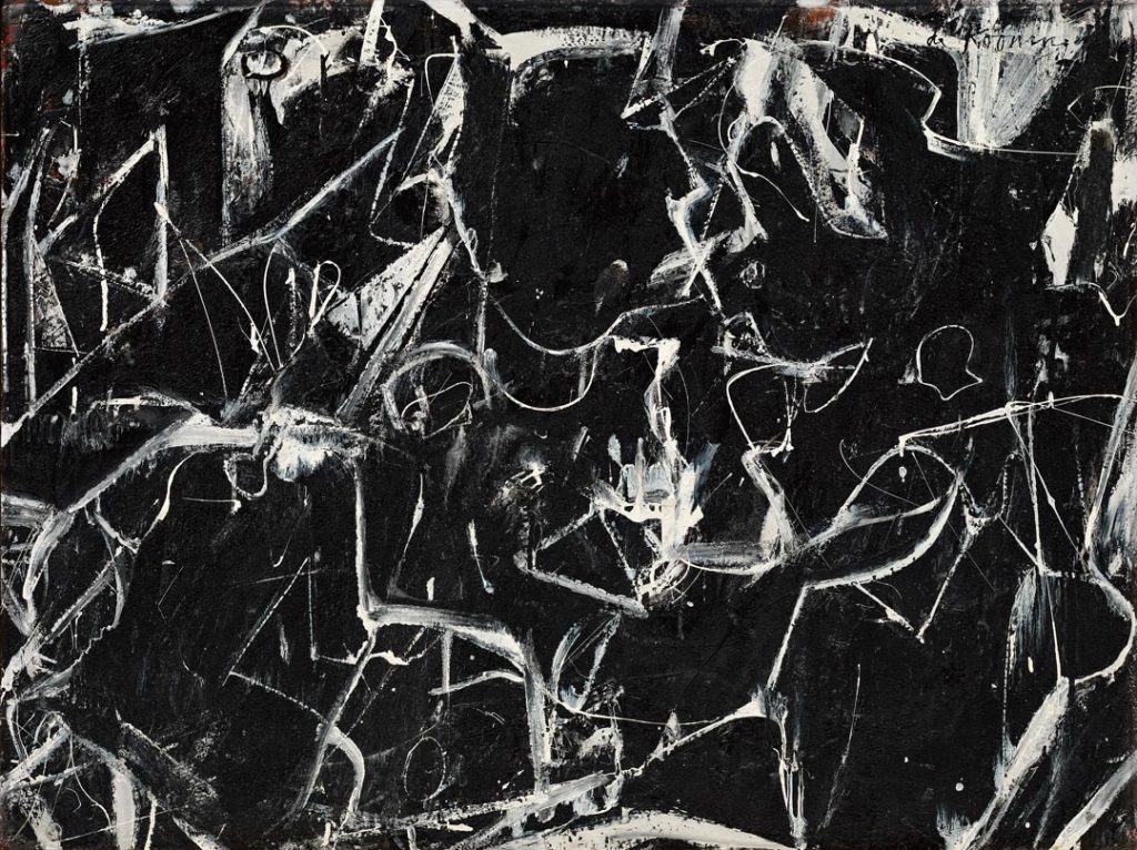
To compare Town Square with the more or less contemporaneous Night Square (ca. 1949, fig. 4) is to see that the filigree drawing of the “black” painting is even more a performance than that of the “white” one. (That is generally true of this period’s canvases, of which most of those in full color seem the least performed.) It is not the only difference: writing in 1960, Harriet Janis and Rudi Blesh distinguished these two kinds of paintings through the language of photography, calling them, respectively, “positives” and “negatives.” Additionally, they observed, “To look rapidly back and forth at these two pictures creates an effect like that of a dark landscape upon which a searchlight flashed on and off.”22 This comparison nicely responds to de Kooning’s often-quoted remark about his painting what he called a “slipping glimpse” or “frozen glimpse.”23 And this pair of paintings well illustrates his most often-quoted description of such works: “It’s like crossing the street. You want to cross the street fast—so you run across”; “I have a little glimpse of something. I want to give somebody else something of that glimpse”; “Content is a glimpse of something, an encounter like a flash.”24
The upper-left corner of Night Square depicts what appears to be the edge of a square with a doorway in an adjacent line of buildings. Town Square does not offer anything similar, although the piled-up rectangular forms down the left margin may be thought to be architectural, implying a down-view on an urban square. However, we do know that de Kooning frequently rotated his canvases as he worked. This is evidenced by various technical devices he employed—for example, using the direction of drips of paint as lines of drawing, and creating interactions between areas of fresh, fluid paint moved onto dry or drying paint to produce seemingly transient effects; and these may be seen in Town Square.25
Additionally, though, we may intuit that canvases have been rotated in order to unsettle compositions that were becoming too stable: slipping glimpses occur when you are taken off guard; equilibrium is not desirable. Seen upside down, in the direction at which it may well have been begun, the incident in Town Square slides in diagonally beside a windowed building at the left, as it does in Night Square, and is disposed across a register line just short of what becomes the bottom of the canvas, on which stand one and probably more prominent figures, with more behind, some with strips of shadow giving them depth. Seen in its completed orientation, these dark zones disengage and flatten to the surface, serving no longer illusion but the interplay of lights and darks within a composition that is now at once suspended from that register line and thrusts diagonally up and across from the bottom-left corner. The activity is arrested by details that demand identification—eyes and orifices; the window or door shapes; perhaps a ladder now at the left; the puzzling, shield-like element beside it—but identification is as often thwarted as satisfied. “Even abstract shapes must have a likeness,” de Kooning insisted.26 A work like Town Square encourages curiosity about what its shapes seem to be as a means of addressing and engaging us— not to make us zealots of explanation, but in order to encourage our enjoyment of uncertainty.
Author
John Elderfield is chief curator emeritus of painting and sculpture at the Museum of Modern Art, New York, where he curated the 2011 exhibition de Kooning: a Retrospective; and a senior curator for special projects at Gagosian, New York, where in 2013 he curated Willem de Kooning: Ten Paintings, 1983–1985. He also edited
Notes
1 The account of de Kooning’s 1948–49 development that follows is indebted to that in John Elderfield, ed., De Kooning: A Retrospective (New York: Museum of Modern Art, 2011), specifically to parts of my introduction (9–46); my chapter on the years 1946–48 (120–87), Lauren Mahony’s on 1948–50 (188–237), and, within these two chapters, the chronologies by Delphine Huisinga and “Methods and Materials” analyses by Susan F. Lake and Jim Coddington. Works by de Kooning dis-cussed but not reproduced in the present text may be found illustrated there, where events mentioned here in passing are more fully described. Further citations of this volume give only the name of the appropriate author. I am, as always on this subject, indebted to Amy Schichtel, executive director of the Willem de Kooning Foundation, and her colleagues for access to the foundation’s archives and for their advice. And for her editorial review, I am grateful to Jeanne Collins.
2 Town Square is one of the three smallest works from these years, almost identical in size to the related “white” pictures, Zot and Attic Study. Leaving aside de Kooning’s three large Woman paintings made in 1948–50, there are five or six with the larger dimension of about four feet or a little more (three of them in de Kooning’s first solo exhibition, in 1948, perhaps because he felt the need to include some larger works) and another four with the larger dimension of three feet or more; in contrast, fourteen works measure less than twenty-four by thirty-six inches. As noted below, these are very much the typical sizes of Analytical Cubist canvases. Their varying sizes broadly correspond to the relative density of these works, a subject also discussed below.
3 Woman (1948) was initially conceived as a black-and-white abstraction to which anatomical elements were subsequently added. See Lake, in Elderfield, De Kooning: A Retrospective, 205; the three large and one smaller Woman paintings of 1948–50 are discussed by Mahony, in Elderfield, De Kooning: A Retrospective, 197–204.
4 See Elderfield, De Kooning: A Retrospective, 167.
5 Willem de Kooning, “What Abstract Art Means to Me,” Bulletin of the Museum of Modern Art 18, no. 3 (Spring 1951): 7; reprinted in Thomas B. Hess, Willem de Kooning (New York: Museum of Modern Art, 1968), and elsewhere. The most extended discussion of de Kooning’s (and Pollock’s) indebtedness to Picasso appears in Michael Fitzgerald, Picasso and American Art (New York: Whitney Museum of American Art, 2006), 169–237, a fine account although, concentrating on expressive works, it does not address Analytical Cubism.
6 Details of the few such works by Picasso that de Kooning could actually have seen may be found in Julia May Boddewyn’s remarkable chronology in Fitzgerald, Picasso and American Art, 328–83.
7 The classic account of this means of composition is that in Clement Greenberg, “Collage,” Art and Culture (Boston: Beacon Press, 1961), 71–72.
8 Elaine de Kooning, Oral history interview by Phyllis Tuchman, August 27, 1981, Archives of American Art, Smithsonian Institution, Washington, DC. See Mahony, in Elderfield, De Kooning: A Retrospective, 195.
9 Elaine de Kooning, “De Kooning Memories,” Vogue, December 1983, 394, as quoted by Mahony, in Elderfield, De Kooning: A Retrospective, 195.
10 Hess, Willem de Kooning, 47. See Mahony, in Elderfield, De Kooning: A Retrospective, 195.
11 Gus Falk, quoted in Mark Stevens and Annalyn Swan, De Kooning: An American Master (New York: Knopf, 2004), 294. See Mahony, in Elderfield, De Kooning: A Retrospective, 211.
12 Harold Rosenberg, “The American Action Painters,” Art News 51, no. 8 (December 1952): 22, 49.
13 See the examples illustrated by Mahony, in Elderfield, De Kooning: A Retrospective, 211, 214, which show the artist adjusting the drawing at different stages of a work’s completion and making clear that de Kooning used drawings of individual motifs on more than a single canvas; on which see also note 25, below.
14 In later paintings, of 1949–50, notably Attic and the appropriately titled Excavation, it is as if de Kooning entirely excavated the underdrawing, their surfaces becoming detailed and methodical, the planes cut into numerous smaller, now more geometric segments, compacted in crystalline effects. De Kooning’s fluid drawing-in-paint of Town Square and similar works was probably made with a liner brush, on which see Paul Cummings as quoted by Mahony, in Elderfield, De Kooning: A Retrospective, 232–34.
15 For de Kooning’s idea of himself as a “performer,” not an “action painter,” see Elderfield, De Kooning: A Retrospective, 18.
16 Space prohibits elaborating these sequences here, but they become evident by simply following the illustrations in De Kooning: A Retrospective, 120–237.
17 This exhibition contained paintings of varying density, size, and coloration. See Elderfield, De Kooning: A Retrospective, 163–74.
18 I discuss this subject in “Excavations,” in my Cézanne: The Rock and Quarry Paintings (Princeton, NJ: Princeton University Art Museum, 2020), 1–39; and its implications for Pollock (and continuing in the work of Brice Marden) in my “Marden in Three Parts,” in Brice Marden: It reminds me of something, and I don’t know what it is (New York: Gagosian, 2020), 15–35, which informed the discussion here on layering in Pollock and de Kooning.
19 On de Kooning’s additions of sand, powdered glass, charcoal, and significant quantities of plaster of Paris into the off-white paint of Woman (1948), see Lake, in Elderfield, De Kooning: A Retrospective, 205–7. Owing to the coronavirus lockdown, it was not possible to examine Town Square to determine whether de Kooning mixed additives to its paint or whether its coarse surface is solely the result of the rough paper on which he painted it. However, Nicholas Dorman, Jane Lang Davis Chief Conservator of Paintings at the Seattle Art Museum, did determine that the broken lines were the result of the skipping of the brush over the rough texture of the support and that, while there may be some charcoal drawing in the work, it was not a primary means of creating the lines, as it was in Woman and, particularly, in the 1946 hybrid compositions Fire Island and Special Delivery (see Elderfield, De Kooning: A Retrospective, 138). The staccato black paint lines in Town Square resemble the beading of lines produced when de Kooning used slick black enamel on drier white paint, or vice versa, as in Painting (1948). See Coddington, in Elderfield, De Kooning: A Retrospective, 175–77). It is clear that de Kooning experimented widely to produce such effects.
20 The commentaries by both Coddington and Lake cited in the preceding note refer to de Kooning adding warmer colors to his white paint.
21 I paraphrase here a 1989 statement by Brice Marden on Pollock’s layering. See Elderfield, “Marden in Three Parts,” 22.
22 Harriet Janis and Rudi Blesh, De Kooning (New York: Grove Press, 1960), 27, 29–30, comparing Town Square with Painting (1948), which, in fact, seems more a still life than a townscape. Quoted by Mahony, in Elderfield, De Kooning: A Retrospective, 209.
23 While these terms do seem very appropriate to the works under discussion here, de Kooning appears to have first used them in the 1959–63 period. The examples given here are recorded in Elderfield, De Kooning: A Retrospective, 20, 157, 183.
24 “Content is a Glimpse,” Location 1, no. 1 (Spring 1963): 47. Originally an interview with David Sylvester, March 1960.
25 De Kooning’s most striking contemporaneous example of direction reversal was Secretary and Night (both 1948), the composition of one traced onto the other, reversed, and painted very differently. See Elderfield, De Kooning: A Retrospective, 157–62.
26 Quoted by Hess, Willem de Kooning, 47.
Explore the Collection
Sort by Chronology
Sort by Artist
Sort by Author
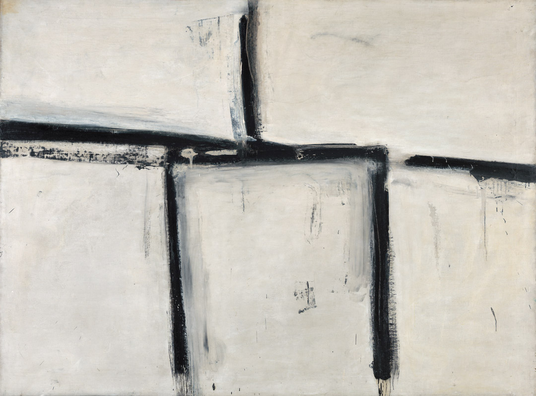
Franz Kline, Painting No. 11, 1951
Acquired November 13, 1970
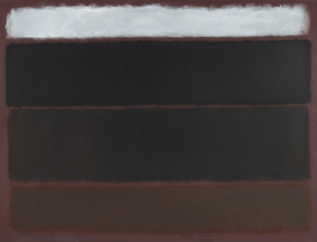
Mark Rothko, Untitled, 1963
Acquired May 18, 1972
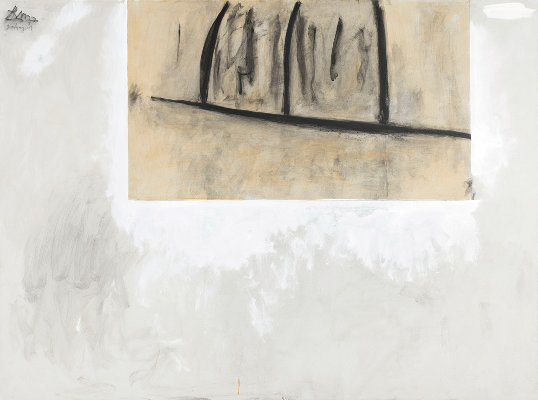
Robert Motherwell, Before the Day, 1972
Acquired October 12, 1972
Adolph Gottlieb, Crimson Spinning #2, 1959
Acquired December 11, 1972
Helen Frankenthaler, Dawn Shapes, 1967
Acquired April 26, 1973
Clyfford Still, PH-338, 1949
Acquired November 10, 1973
Ad Reinhardt, Painting, 1950, 1950
Acquired January 8, 1974
Jackson Pollock, Untitled, 1951
Acquired March 29, 1974
Francis Bacon, Portrait of Man with Glasses I, 1963
Acquired October 24, 1974
Alberto Giacometti, Femme de Venise II, 1956
Acquired January 2, 1975
Robert Motherwell, Irish Elegy, 1965
Acquired November 7, 1975
Francis Bacon, Study for a Portrait, 1967
Acquired November 20, 1976
Willem de Kooning, Town Square, 1948
Acquired December 6, 1976
Joan Mitchell, The Sink, 1956
Acquired September 12, 1977
David Smith, Cubi XXV, 1965
Acquired February 22, 1978
Philip Guston, To B.W.T., 1952
Acquired February 14, 1979
Mark Rothko, Untitled, ca.1945
Acquired November 12, 1980
Lee Krasner, Night Watch, 1960
Acquired November 19, 1981
Philip Guston, The Painter, 1976
Acquired February 1, 1982

